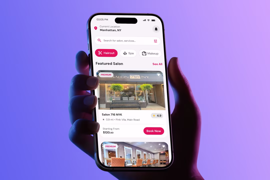
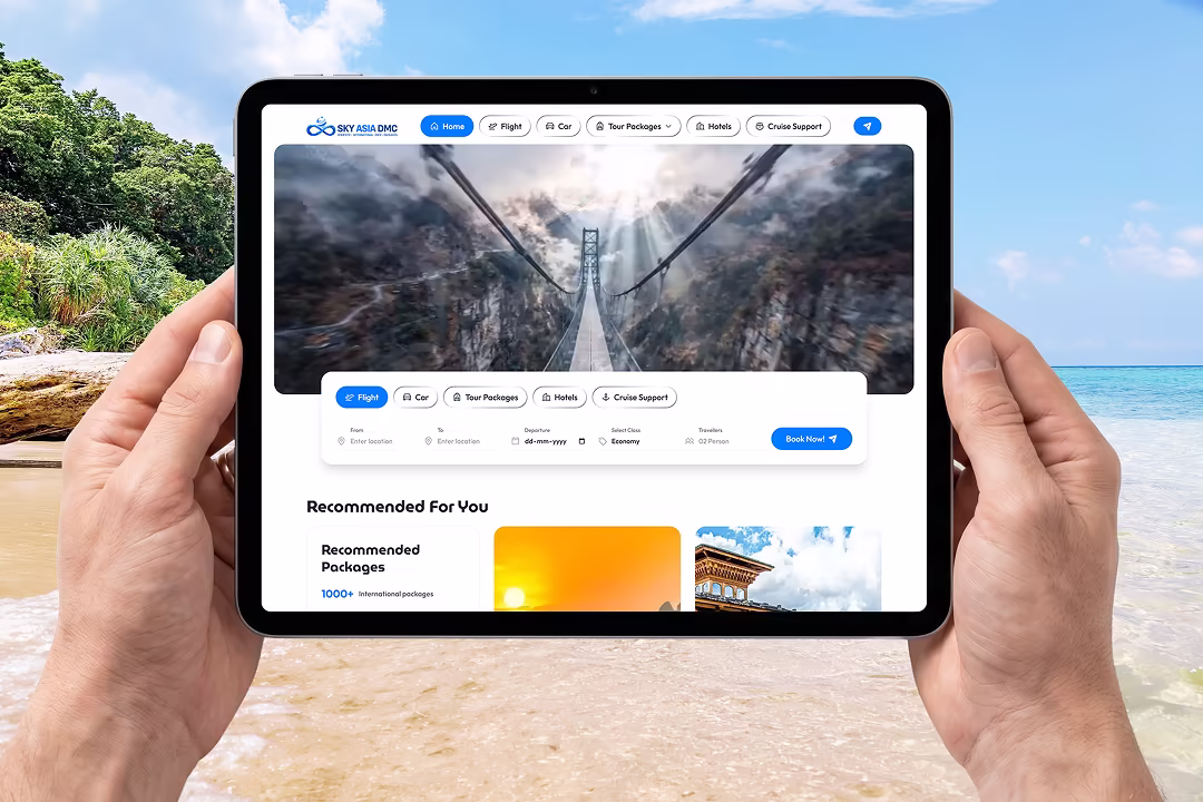
Solar Days - Solar EPC Company Website Design for Northeast India Banner

Solar Days - Solar EPC Company Website Design for Northeast India

Solar Days Homepage Hero Section with Solar Field Background and Quick Stats
Solar Days Product Catalog Grid Showing Panels, Inverters and EPC Equipment
Solar Days Completed Installations Portfolio with Filter Tabs

Project Overview

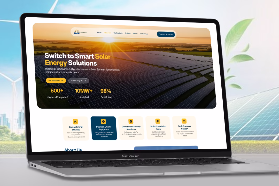
Solar Days needed a website that could position them as a credible EPC partner for residential, commercial, and industrial clients, showcase their full product catalog with clarity, and convert visitors into qualified solar consultation leads.

Requirements

  • Trust-building hero section with measurable proof points
  • Clear EPC service breakdown for engineering, procurement, and commissioning
  • Organised product catalog covering panels, inverters, batteries, and accessories
  • Filterable project portfolio across residential, commercial, and industrial categories
  • Direct lead capture form integrated within the services section
  • Brand credibility section featuring industry partner logos

Client

Solar Days Private Limited

India

Industry

Solar Energy Solutions

Solar Days Website Side Preview — Product Grid and Lead Form

Problem Statement

  • Solar EPC websites in the regional market typically open with generic stock imagery that fails to communicate scale or operational credibility.
  • Product information for panels, inverters, batteries, and accessories was scattered without a unified catalog structure, making comparison difficult for buyers.
  • Service offerings such as EPC support, subsidy assistance, and installation were not visually differentiated, so prospects could not quickly identify what was included.
  • Completed project portfolios lacked categorisation, forcing residential and industrial visitors to scroll through irrelevant project types.
  • Lead capture was buried at the bottom of the page, separated from the content that built buying confidence.
  • There was no clear way to signal brand partnerships with established manufacturers, weakening perceived reliability against larger competitors.

Solution & Results

  • Designed a full-width hero using real solar field photography with a golden hour tone, paired with a bold headline and three proof-point stats covering projects completed, capacity installed, and satisfaction rate.
  • Built a five-card service highlight row directly below the hero covering EPC services, premium equipment, subsidy assistance, skilled installation, and 24x7 support, with one card visually emphasised in deep navy for contrast.
  • Structured an About Us section combining company narrative with a checklist of six core capabilities alongside a real site photograph and an experience badge.
  • Created a nine-item product grid organised in a consistent three-column layout, each card carrying a product image, category badge, capacity tag, and product name for instant scannability.
  • Designed a dark navy services and lead-generation band that pairs three EPC value propositions with an inline consultation form and four supporting stats, placing conversion directly alongside trust content.
  • Built a filterable project portfolio with category tabs for All, Residential, Commercial, and Industrial, displaying six completed installations with capacity, location, and project type badges.
  • Closed the page with a manufacturer trust strip featuring recognised solar brands, reinforcing supply chain credibility before the footer.

Design Process

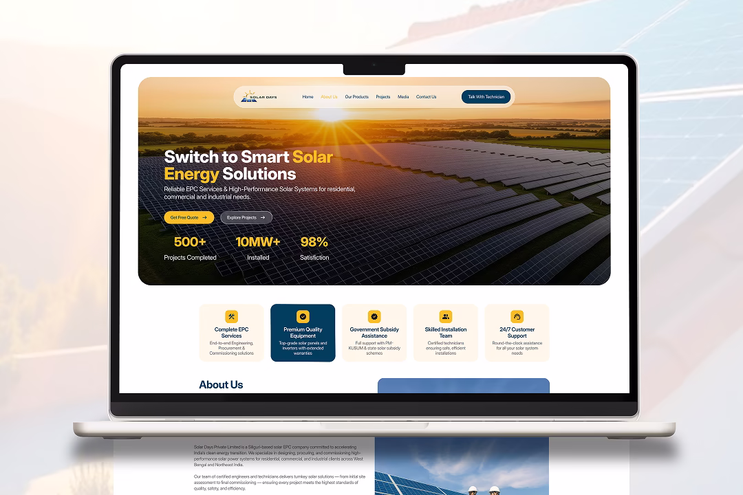
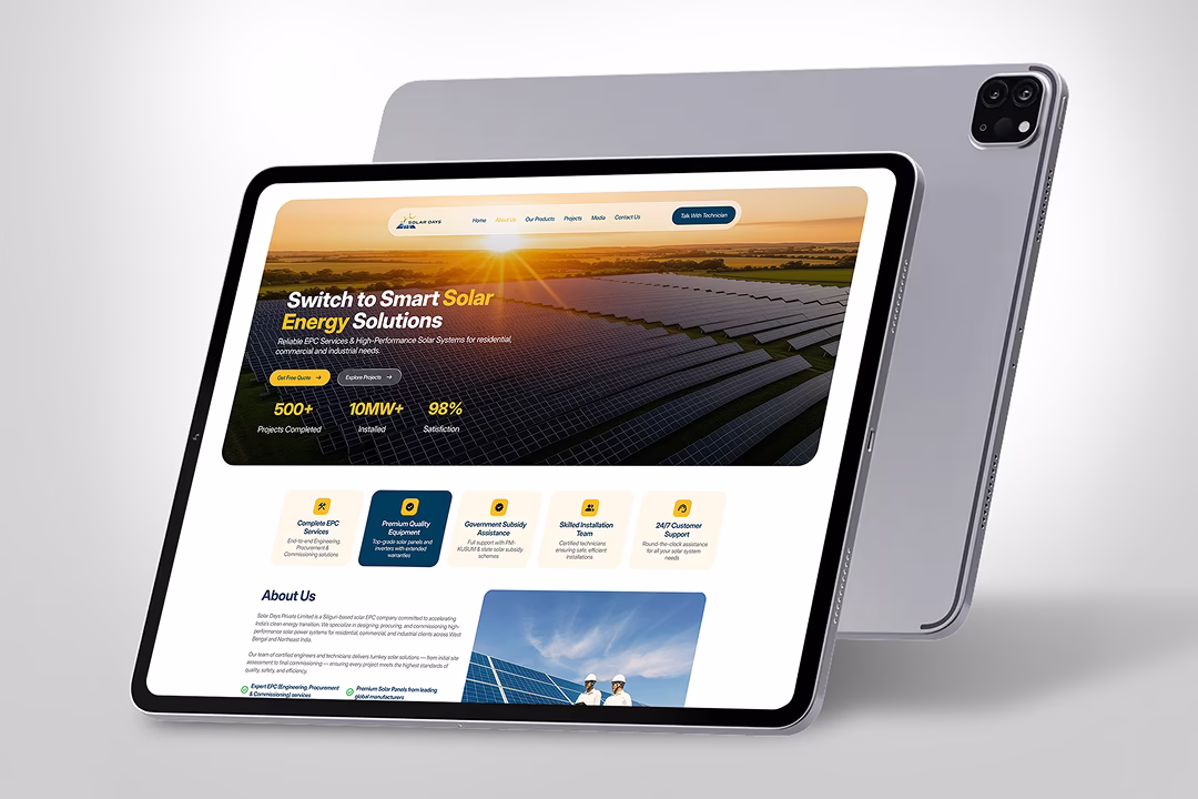
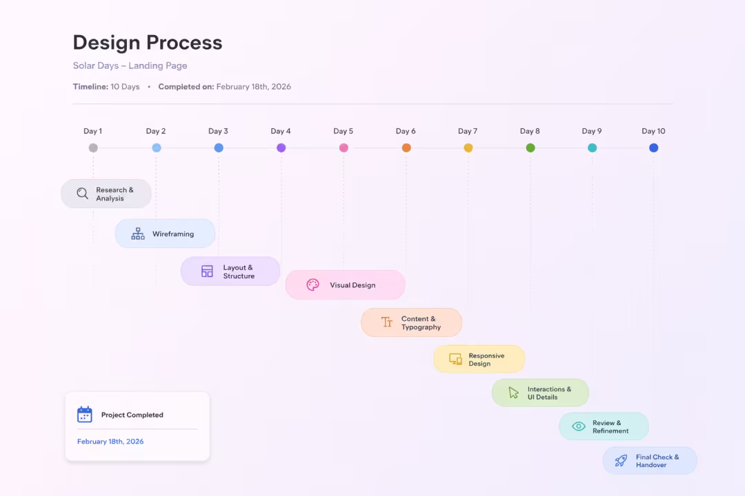
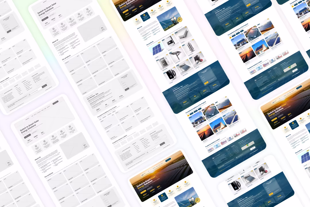
The design process started with identifying the three buyer segments — homeowners, commercial property owners, and industrial operators — and mapping what each group needed to see before requesting a quote. The page structure was sequenced around a trust-then-product-then-proof flow, moving from hero credibility stats to service clarity, product depth, completed work, and finally brand partnerships. The lead capture form was positioned mid-page rather than only in the footer, placing the conversion point where buying confidence peaks.

Solar Days Design Process — Page Structure and User Journey Mapping by MHR Studio

Style Guide & Components

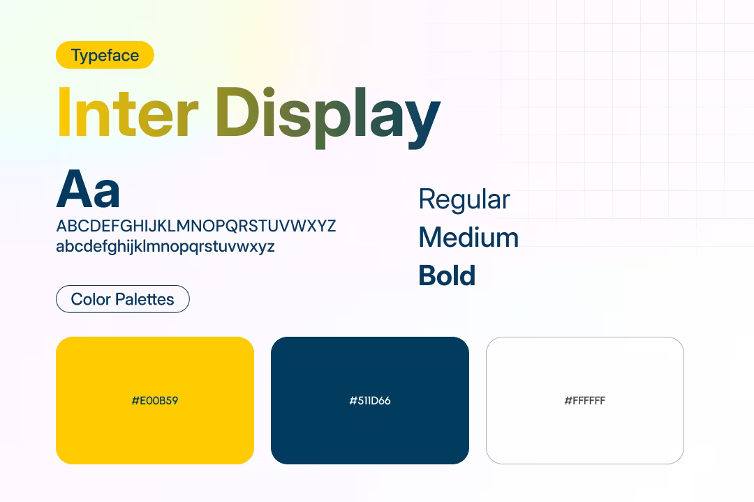
The visual language pairs a warm golden accent with a deep navy blue, reflecting both solar energy and enterprise reliability. The golden tone is used for primary CTAs, stat highlights, and active filter states, while navy anchors the services and lead generation band. Cards use soft shadows, rounded corners, and consistent badge placement for category and capacity labels across products and projects. Typography uses a confident serif-adjacent display style for headings paired with a clean sans-serif for body content, creating a balance between premium positioning and technical clarity.

Solar Days Style Guide — Colour Palette, Typography, and Component System

Wireframe & UI Design

Wireframes mapped the full homepage flow from hero through to footer, with particular focus on the product grid density and the placement of the lead capture form within the services band. The project portfolio filter system was wireframed with multiple tab states before finalising the All, Residential, Commercial, and Industrial structure. High-fidelity screens were delivered for the complete homepage including hero, services, about, products, lead generation, portfolio, and partner trust sections.

Solar Days Wireframes — Homepage Layout and Product Grid Structure

Client Feedback

Soumik Agarwal — Director, Solar Days Private Limited

We wanted our website to feel as serious as the projects we deliver. MHR Studio gave us a homepage that shows our scale, our products, and our completed work in a way that builds confidence immediately. The lead form placement has made a real difference — people are filling it out while they're still reading about our services.

Soumik Agarwal

Director, Solar Days Private Limited

Home
Contact