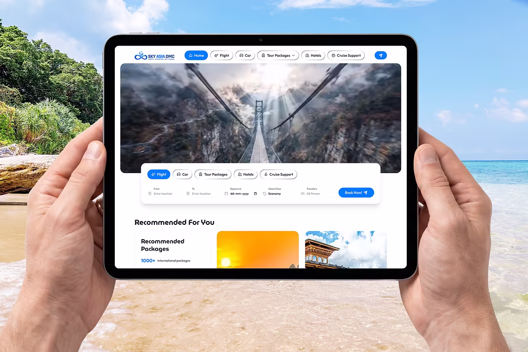
Oneshort - Salon Booking App UI/UX Design for Beauty & Wellness Banner

Oneshort - Salon Booking App UI/UX Design for Beauty & Wellness

Oneshort Home Screen with Location, Search, Service Filters and Featured Salons
Oneshort Date and Time Slot Selection Screen for Spa and Haircut Booking
Oneshort Project Overview Slide Showing App Name, Industry, Platform and Role

Project Overview

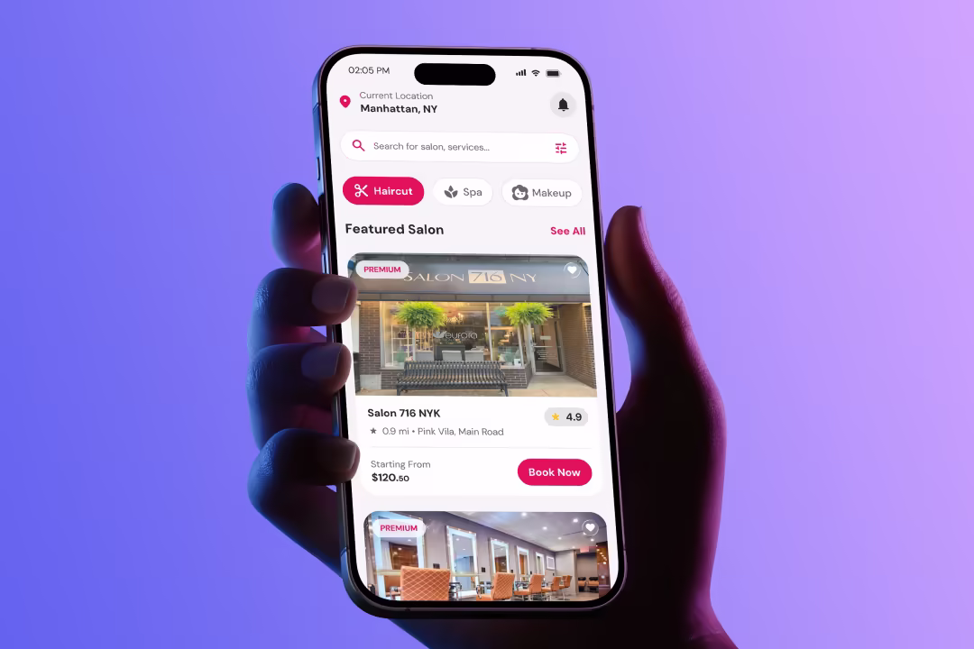
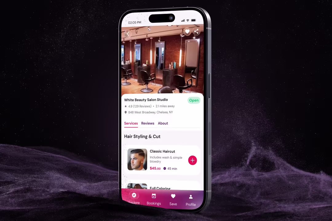
Oneshort is a modern salon booking app designed for iOS and Android, enabling users to discover nearby salons, browse services by category, and book appointments with real-time slot availability — all within a clean, fast, and visually premium mobile interface.

Requirements

  • Location-aware salon discovery with proximity and rating signals
  • Service category filtering for Haircut, Spa, and Makeup
  • Featured salon cards with pricing transparency and premium tier badging
  • Real-time time slot booking screen with Morning, Afternoon, and Evening groupings
  • Clear available and booked state differentiation for time slots
  • Minimal, high-contrast UI system that works across iOS and Android
  • Fast path from discovery to confirmed booking within three taps

Problem Statements

  • Salon discovery in existing beauty apps required too many steps before a user could see relevant options near their current location.
  • Service category navigation was either absent or buried in secondary menus, forcing users to search manually rather than browse by intent.
  • Booking flows in competing apps lacked real-time slot availability visibility — users only discovered unavailability after selecting a time, creating frustration and drop-off.
  • Featured and premium salon listings had no visual distinction, reducing perceived value for top-tier salon partners and weakening monetisation potential.
  • Pricing information was hidden behind detail pages, removing the ability to make quick budget-based decisions from the discovery screen itself.
  • The absence of time-of-day grouping in booking screens made slot selection slow and cognitively demanding.

Solution & Results

  • Designed a location-first home screen displaying the user's current city prominently, with a contextual search bar supporting both salon name and service queries.
  • Built a three-tab service category filter using pill-style toggles with icon reinforcement — active state uses the brand's deep pink for instant visual feedback.
  • Created featured salon cards with full-bleed photography, a Premium badge for partner salons, a heart icon for saving, star rating, proximity distance, starting price, and a Book Now CTA on a single scannable card.
  • Designed a booking screen with a horizontal date strip, a selected service summary card showing service icon, name, price, and duration, and time slots organised into Morning, Afternoon, and Evening groups.
  • Used clear typographic and colour differentiation between available slots and booked slots — eliminating the need for any explainer copy.
  • Maintained a light background throughout with a single strong accent colour reserved for primary actions and brand moments only.

Design Process

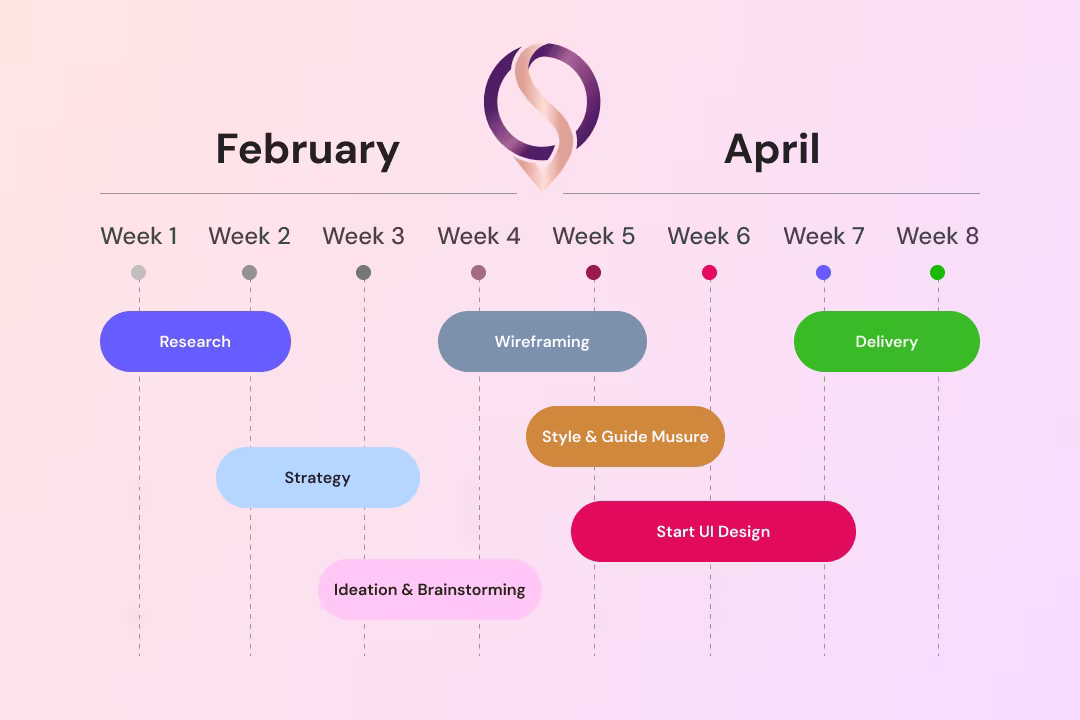
The design process began with mapping the core user journey from app open to confirmed booking. Competitive analysis of Booksy, Fresha, and StyleSeat informed the navigation architecture decisions. Wireframes were built for the home screen, service detail, and booking flow before moving to high-fidelity. Component decisions prioritised thumb-zone accessibility and one-handed usability throughout.

Oneshort Design Process — Wireframes and User Flow Mapping by MHR Studio

Style Guide & Component

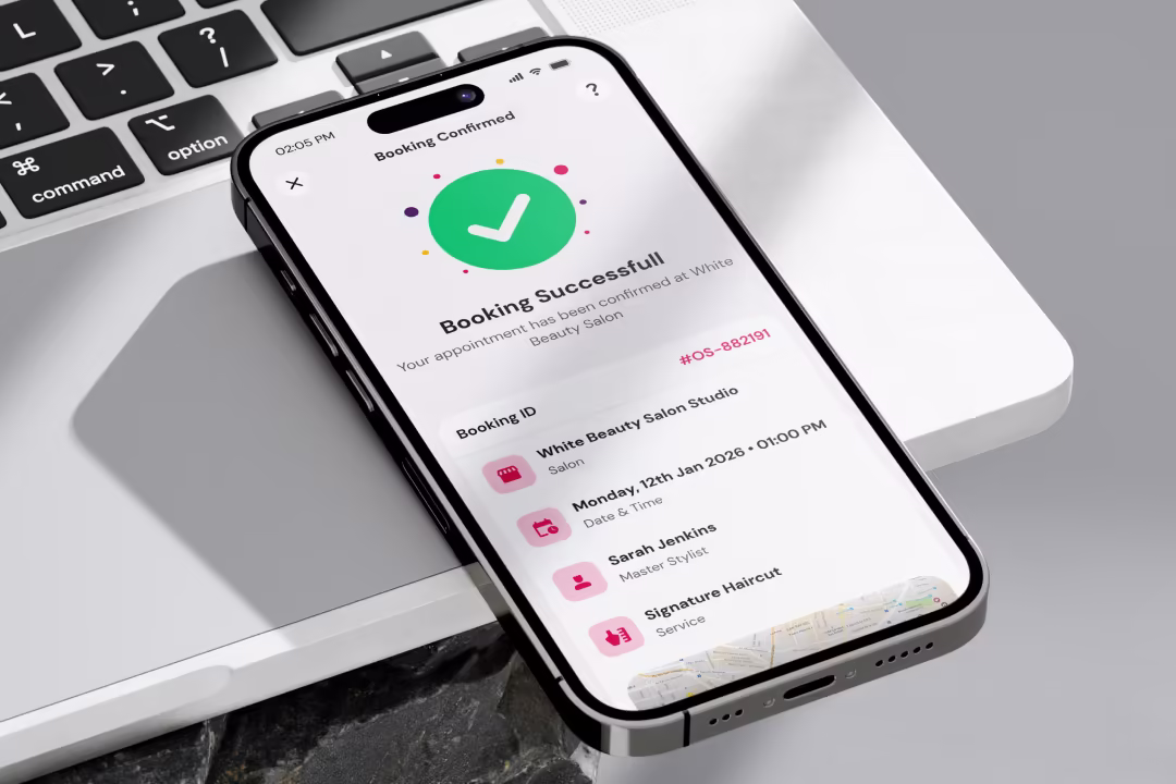
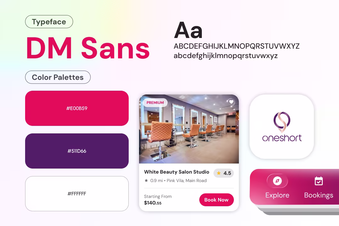
The visual language uses a soft off-white background to reduce eye strain during browsing sessions. Deep pink serves as the single brand accent — used exclusively for active states, CTAs, pricing highlights, and selected date tiles. Card components use generous rounded corners and subtle shadows to create depth without visual noise. Booked states use strikethrough and muted grey to communicate unavailability without requiring icons or labels.

Oneshort Style Guide — Colour Palette, Typography, and UI Component System

Wireframe & UI Design

Low-fidelity wireframes established the home screen hierarchy, service filter placement, salon card structure, and booking screen layout before any visual design began. The date strip, time slot grid, and service summary card went through two wireframe iterations to optimise information density and touch target sizing. Final high-fidelity screens were delivered for both the home screen and booking flow with complete component states.

Oneshort Wireframes — Home Screen and Booking Flow Low-Fidelity Layouts

Client Feedback

Marcus Webb — Product Lead, Oneshort

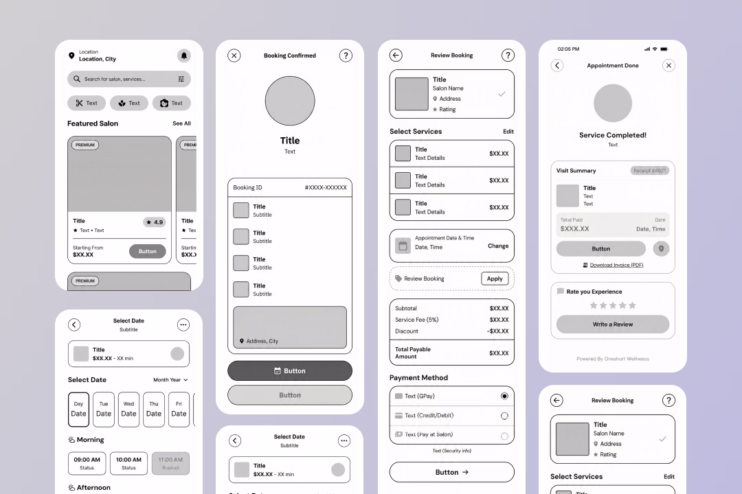
The booking screen alone was worth the entire engagement. Masud understood exactly how users think when they are choosing a time slot — the Morning, Afternoon, Evening grouping was his idea and it made the whole flow feel obvious. The home screen converts browsers into bookers without any friction.

Marcus Webb

Product Lead, Oneshort

Home
Contact